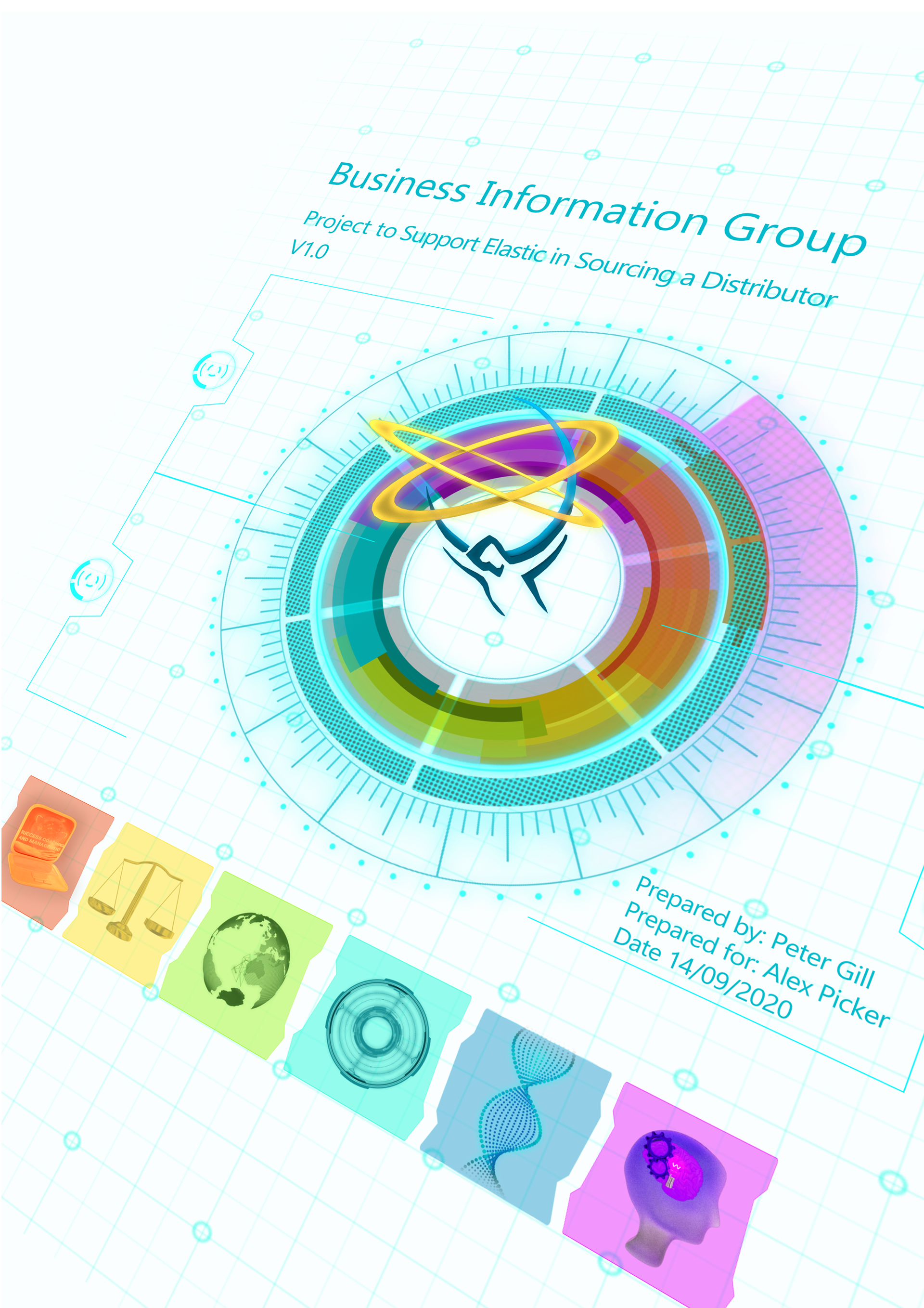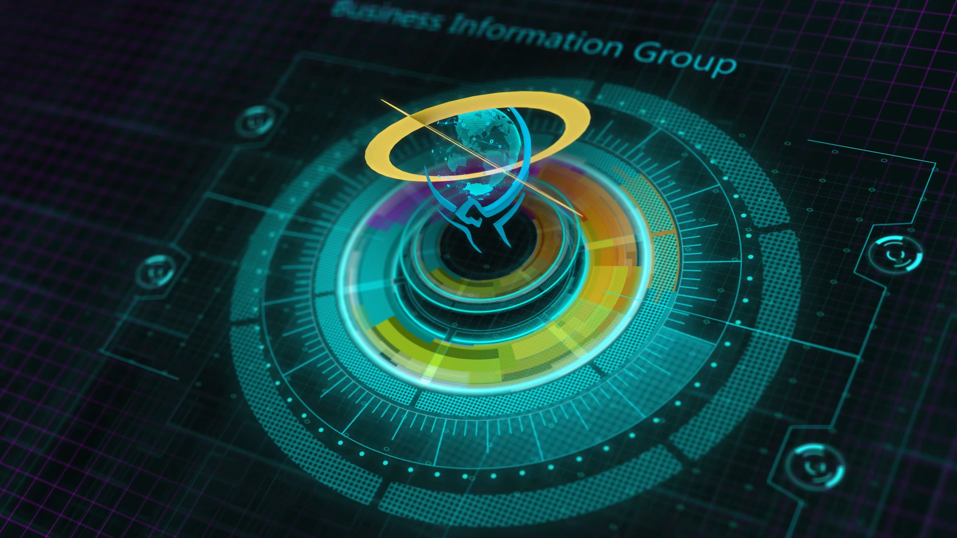
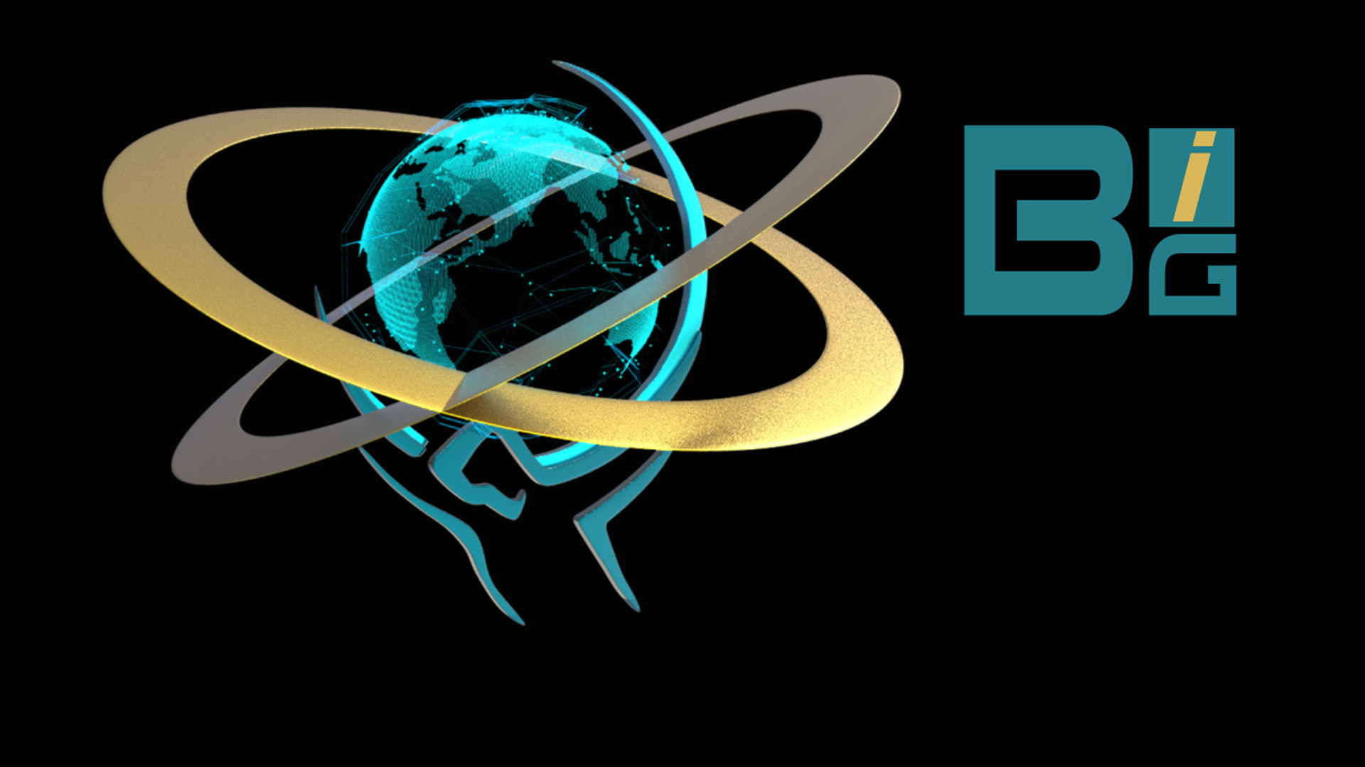
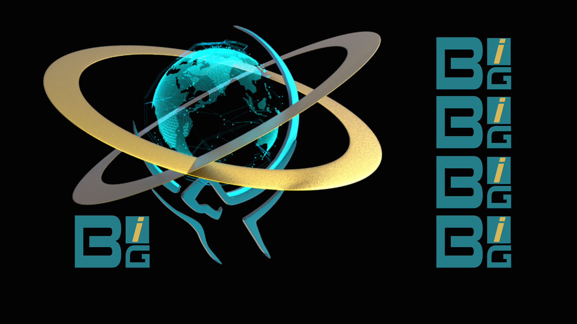
Business Information Group was a start up company where I was tasked with designing a refreshed Brand for the company. Their existing logo consisted of a man holding the earth on his shoulders. The clients wanted to keep this logo as their existing clients were familiar with it, so the assignment was to refresh the brand and logo. I took their original logo and took it into 3D and After Effects. I added graphic elements so the earth became a digital earth produced in Maya Mash motion graphics system. I also created a fully rigged and animated 3D character so that the man from the logo could come to life.
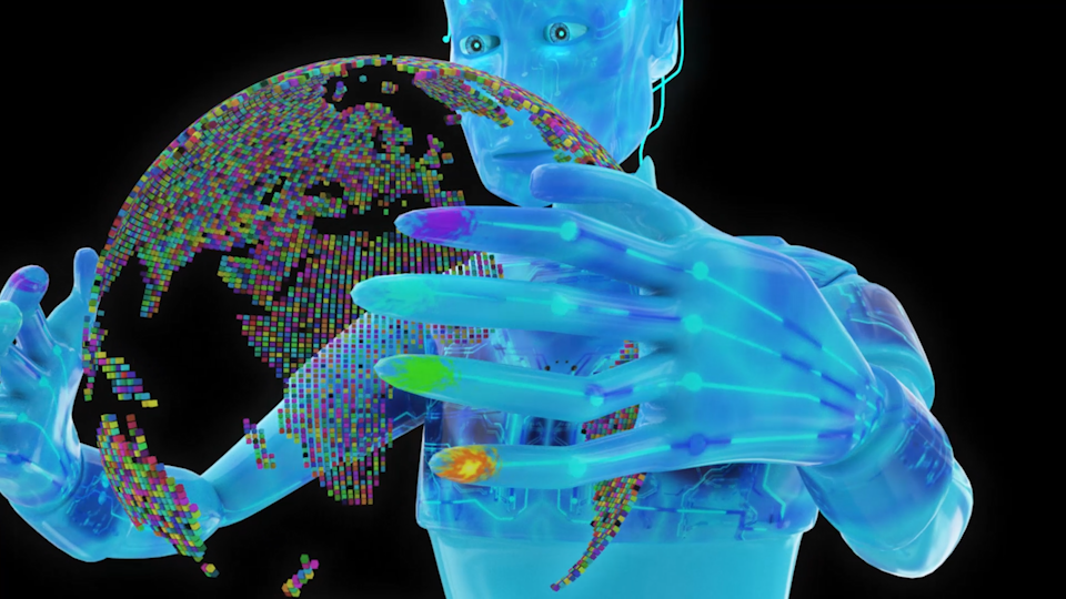
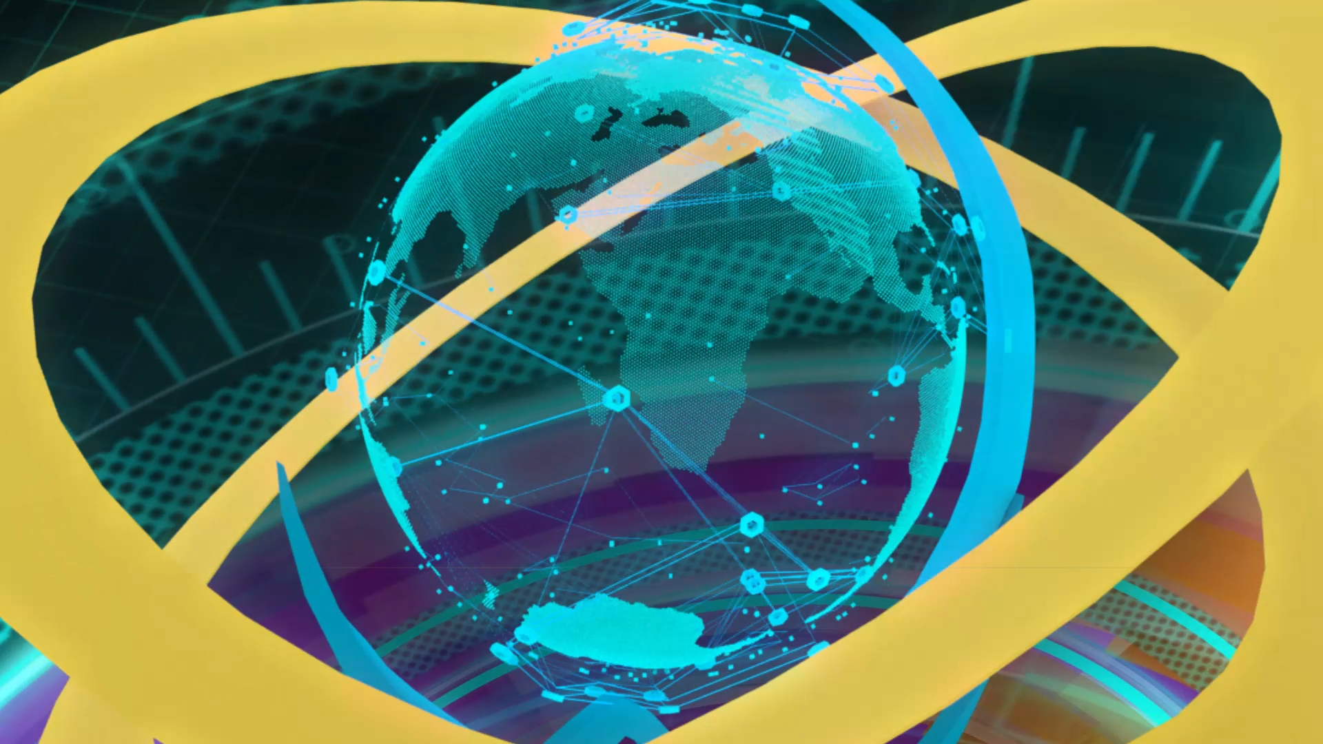
The idea for the animation was that the HUD colour element generates and controls the logo. Which then sends out signals and information in the format of colours which connect with the icons which represent the sectors of business that BIG deals with. The coloured Icons representing: Orange is Accountancy, Yellow is Law/Legal, Green is Low Carbon, Turquoise is Technology, Blue is Pharmaceutical and Purple is Corporate Business Knowledge.
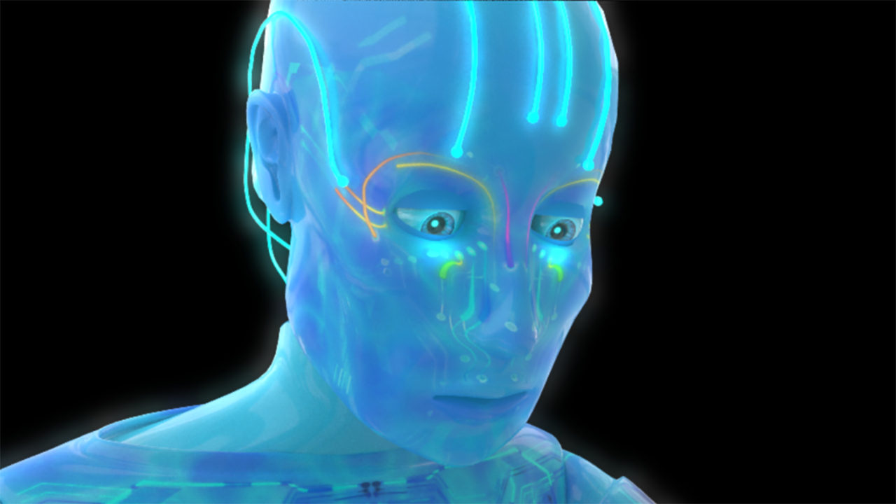
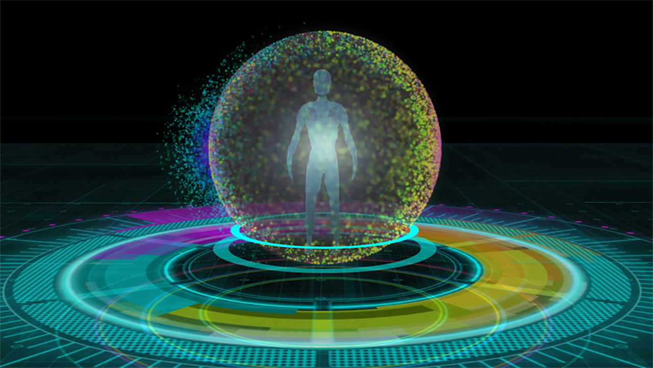
The different business icons are then activated and they send signals out across the knowledge network and the Blue Man from the logo, becomes an actual person/being generated by the colours/electronic signals, which represent business knowledge from the icons being sent. The Blue Man then receives the information from the coloured earth created and it travels through his body.
All credit for the music goes to: ''Suspense synth 02 (arcade)'' tyops (freesound.org)
Licensed under Creative Commons: Attribution 4.0 International (CC BY 4.0) http://creativecommons.org/licenses/by/4.0/
Licensed under Creative Commons: Attribution 4.0 International (CC BY 4.0) http://creativecommons.org/licenses/by/4.0/
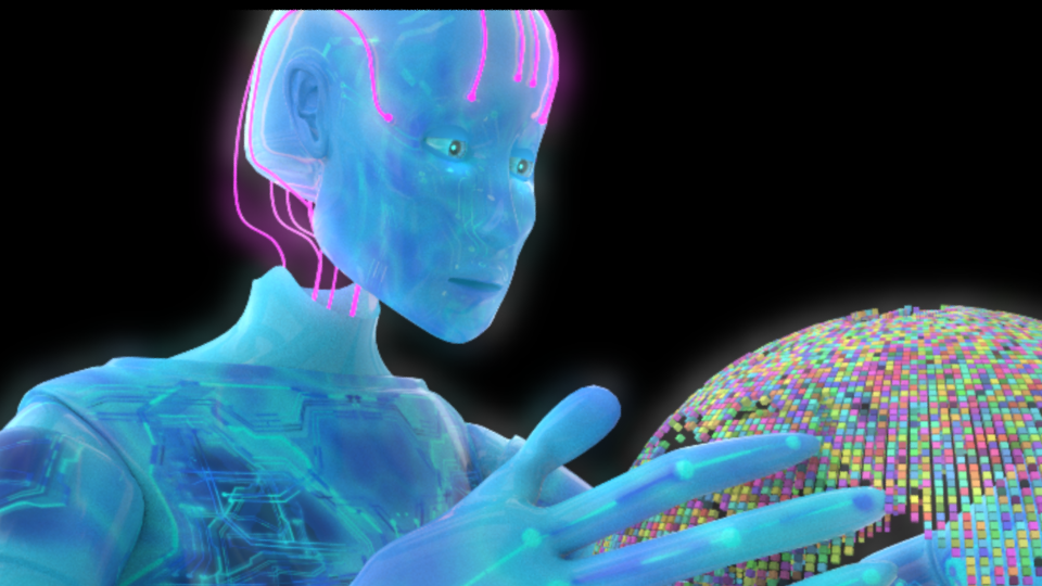
I am currently creating the part which would be animated info graphics which explain how each business icon element works. Also the blue man holds the coloured earth. because it is part of the ethos of the logo ( in which the man holds the earth). So I based the idea about him holding all the business knowledge in his hands and also the use of the world conveys it is an international business. The earth was created in all the different colours to convey the business knowledge is spread all around the globe.
Also I demonstrated that high quality still images can be obtained from any of the videos, which can be good because they give a sense of motion blur and movement. I also demonstrated that they can be used in this format for branding purposes. Animation do not have to be stand alone pieces they can be created to form the whole branding ethos of the business.
I also produced a 'Pitch' document which they could amend themselves and customize for different clients. I prepared it in InDesign and then I transferred it into Powerpoint so that they could easily edit the document. This document was developed before the animation and rebranding and I used the ideas I created when designing the document to influence the animation and logo rebranding.
I had to keep it vey simple as I knew it would have to go into the Powerpoint documents so I couldn't make the layouts complicated or use layouts they may find complicated to use. As it was a document they would be editing themselves.
I had to keep it vey simple as I knew it would have to go into the Powerpoint documents so I couldn't make the layouts complicated or use layouts they may find complicated to use. As it was a document they would be editing themselves.